Top Retro Gas Pump Sign Styles for Global Buyers
Retro Gas Pump Sign styles are returning to garages, diners, museums, hospitality spaces, and private collections worldwide. Their appeal is visual, but purchasing decisions require more than nostalgia. Buyers must compare typography, enamel finishes, weather resistance, mounting systems, lighting, and shipping requirements.
The Sign Research Foundation emphasizes that effective signage depends on visibility, legibility, context, and user experience. Its research supports a practical point: a beautiful sign can still fail when viewed from a distance or installed in poor lighting. Grand View Research also identifies continued growth in the global outdoor advertising and signage sector, although its reports do not isolate retro gas pump products. That limitation matters. Market data can guide direction, but it cannot replace product inspection.
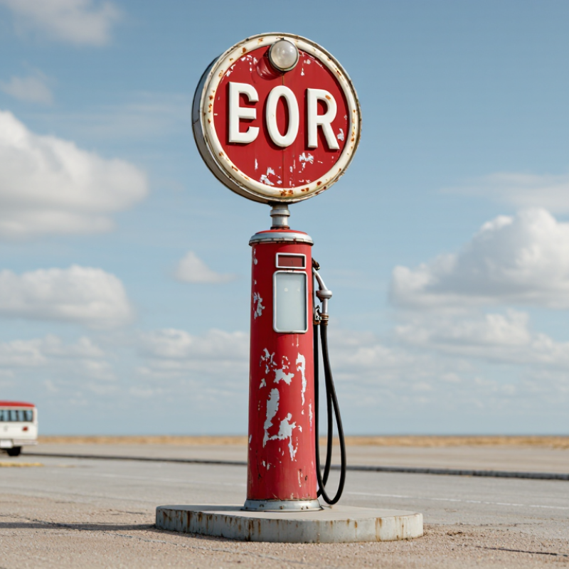
Sign historian John A. Jakle observed, “Signs are the most visible and ubiquitous features of the American landscape.” His observation explains why a Retro Gas Pump Sign can shape an entire room. A faded red face, raised white lettering, and a slim metal pole create immediate visual memory. The wrong proportions can look theatrical, though.
This guide examines popular sign styles for global buyers, including classic gasoline branding, roadside service designs, neon-inspired panels, and minimalist reproductions. It also considers supplier transparency, material specifications, electrical safety documentation, packaging quality, and regional installation conditions. Buyers should request close-up photos, finish samples, and dimensional drawings before ordering. Small details matter. Not every vintage-looking sign is convincingly vintage. Some are simply distressed products with weak construction.
Origins and Evolution of Retro Gas Pump Sign Design
Top Retro Gas Pump Sign Styles for Global Buyers
Origins and Evolution of Retro Gas Pump Sign Design
Retro gas pump signs began as practical roadside markers. Early designs used tall poles, bold lettering, and simple color blocks. Their purpose was immediate visibility from moving vehicles. Curved metal panels later added depth, especially during the 1930s and 1940s. Porcelain enamel became popular because it resisted rain, fuel stains, and strong sunlight.
The style changed again after the 1950s. Designers introduced illuminated boxes, molded edges, starbursts, and warmer color contrasts. Many signs now imitate those details with powder-coated steel, acrylic faces, and low-energy LED lighting. The International Sign Association’s industry outlook identifies digital systems and energy efficiency as major signage priorities. This explains why modern retro signs often hide efficient lighting behind traditional forms. The U.S. Energy Information Administration reported about 145,000 retail gasoline stations nationwide in recent years, showing the continuing scale of this visual environment.
Details matter. A convincing reproduction needs period-appropriate type, restrained weathering, and accurate mounting height. In restoration work, overly clean surfaces can look less authentic than gentle fading. Some buyers also choose rust effects too aggressively. That is a mistake. Weathering should suggest age, not structural weakness. Global buyers must also review local electrical rules, wind-load requirements, and language visibility. Historical accuracy is valuable, but it should never compromise safety or readability.
Key Visual Styles in Classic Gas Pump Signage
Classic gas pump signage is recognized by strong silhouettes and limited color palettes. Shield, oval, and rectangular forms remain popular with global buyers. Their shapes read clearly from a distance. Deep red, cream, navy, and faded yellow create an authentic period mood.
Raised lettering adds useful visual depth. Porcelain-coated steel often gives signs a smooth, glossy surface with crisp edges. Painted metal feels warmer, especially when small scratches reveal its age. A softly distressed finish can suggest decades of outdoor exposure. Too much distressing, however, may look artificial. That is worth questioning.
From practical sourcing experience, buyers should inspect lettering thickness, mounting holes, and edge protection. Outdoor signs need coatings that resist ultraviolet light, moisture, and temperature changes. Illuminated versions require carefully specified wiring and voltage for the destination market. This detail is easy to overlook. A sign may look perfect in photographs but arrive with weak corners or uneven paint. Request close images of the surface, rear panel, and fasteners before purchase. Also confirm dimensions, packed weight, and installation space. Small proportions can change the entire display. A narrow sign above a vintage-style pump may feel elegant, while an oversized one can dominate the setting. Retro design works best when visual age, material quality, and practical safety support each other.
Materials, Colors, Fonts, and Lighting Features
Retro gas pump signs succeed when material, color, typography, and light feel historically believable. Powder-coated steel offers a rigid face and strong outdoor durability. Aluminum is lighter, but it can appear less authentic without embossed details. Porcelain-style finishes create a glossy, aged surface. Choose carefully. Real weathering is attractive; artificial rust can look careless.
Color controls recognition from a distance. Cream, deep red, petrol blue, and muted yellow suggest mid-century service stations without copying any brand identity. High-contrast palettes improve reading speed, especially beside busy roads. Font choice matters more than many buyers expect. Condensed sans-serif lettering saves space, while slab serif fonts add a mechanical character. A 2023 report from the Sign Research Foundation emphasizes legibility, viewing distance, and contrast as core wayfinding factors. Oversized decorative fonts may look impressive, but they often reduce clarity.
Lighting should support the sign, not overpower it. LED modules provide lower heat and longer service life than older fluorescent systems. The International Energy Agency reports that lighting uses roughly 15% of global electricity, so efficient illumination deserves attention. Warm white light, around 2700K to 3000K, suits nostalgic designs. Yet brightness standards vary by location, and local approval should be checked before installation.
Tips: Request powder-coating samples, night photographs, and font proofs. Test the sign from its actual viewing distance. Ask whether replacement LEDs and wiring are accessible. Reconsider excessive distressing; a cleaner sign may communicate quality better. Personally, I prefer small imperfections, but inconsistent aging can weaken the design.
Selection Criteria for Authentic Retro Gas Pump Signs
Authentic retro gas pump signs begin with provenance, not appearance. Ask for dated photographs, original invoices, station records, or restoration notes. A convincing surface can still hide a modern reproduction. Check the sign’s dimensions against period pump catalogs and archived service photographs.
Material matters. Measure the steel panel, inspect the porcelain edge, and look for uneven fading around mounting holes. Original porcelain usually shows layered chips, shallow scratches, and softened lettering. Artificial distress often repeats too neatly. The International Sign Association’s economic impact research shows that clear on-premise signage can influence consumer decisions, so legibility remains important, even for decorative pieces. Authenticity should not reduce practical visibility.
Use data, carefully. Grand View Research estimated the global outdoor advertising market at about USD 38.6 billion in 2023, reflecting continued demand for durable visual communication. That figure does not prove demand for vintage signs, but it supports checking weather resistance and display performance. Ask whether paint, porcelain, or printed metal was used. Request close images of the back, fasteners, seams, and any electrical components. UL safety guidance and local electrical codes should guide illuminated signs.
I inspect the rear first. It is less glamorous. It often tells more. A seller who cannot explain restoration choices deserves cautious questions. I would also record imperfections, because a small mismatch in color or lettering may reveal later repair rather than genuine age.
Top Retro Gas Pump Sign Styles for Global Buyers
Approximate periods when major retro gas pump sign styles were widely used. Buyers can compare a sign’s material, construction, typography, and finish with the historical period it claims to represent.
Selection guide: For authenticity, check whether the sign’s materials, lettering method, mounting hardware, surface wear, and production details are consistent with its stated era. Regional production timelines varied, so these periods should be used as a practical reference rather than an exact date range.

